Starting Thoughts
Initially I thought that I would make this logo here
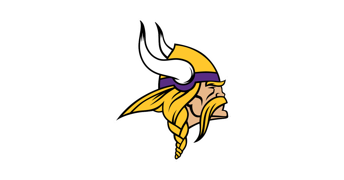
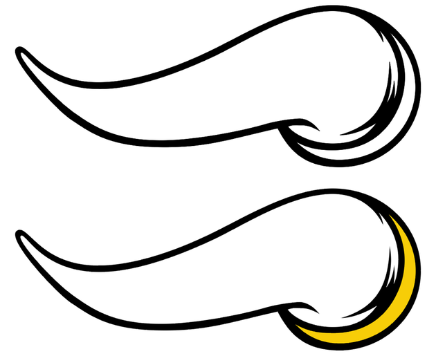
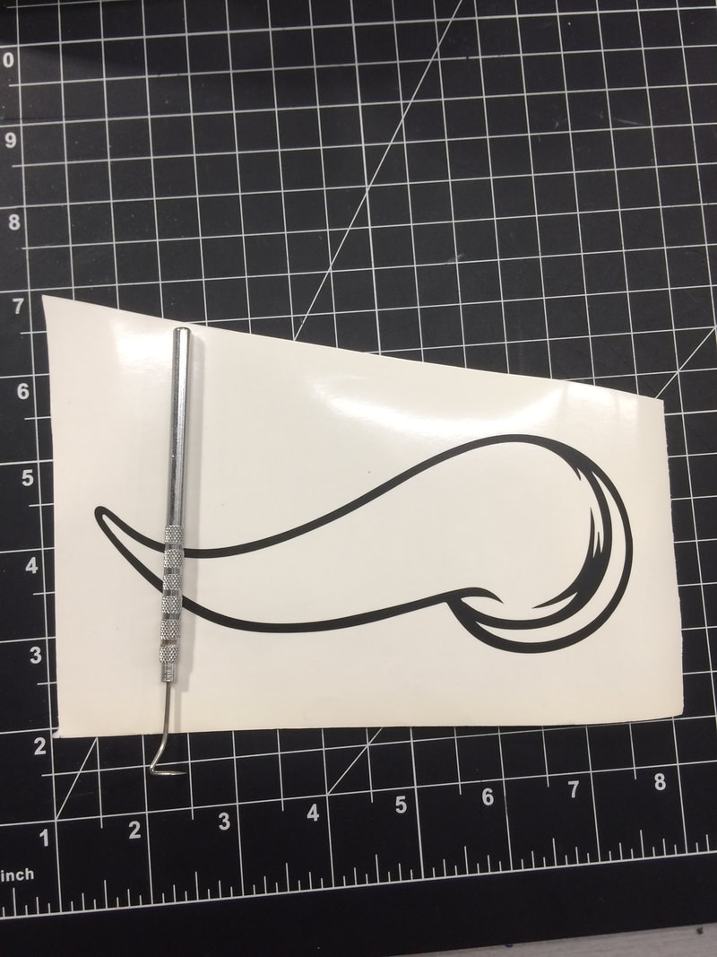
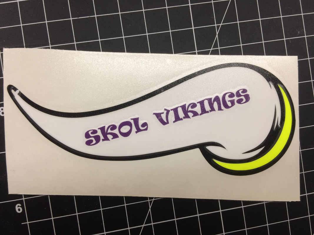
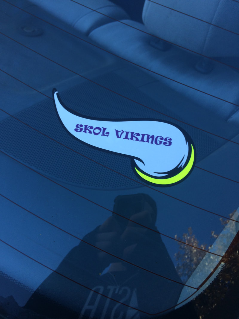
But I found out that I'm not very skilled at Illustrator. I couldn't separate all the different colors well enough to make a product that I'd like. I ended up doing this Vikings logo instead.
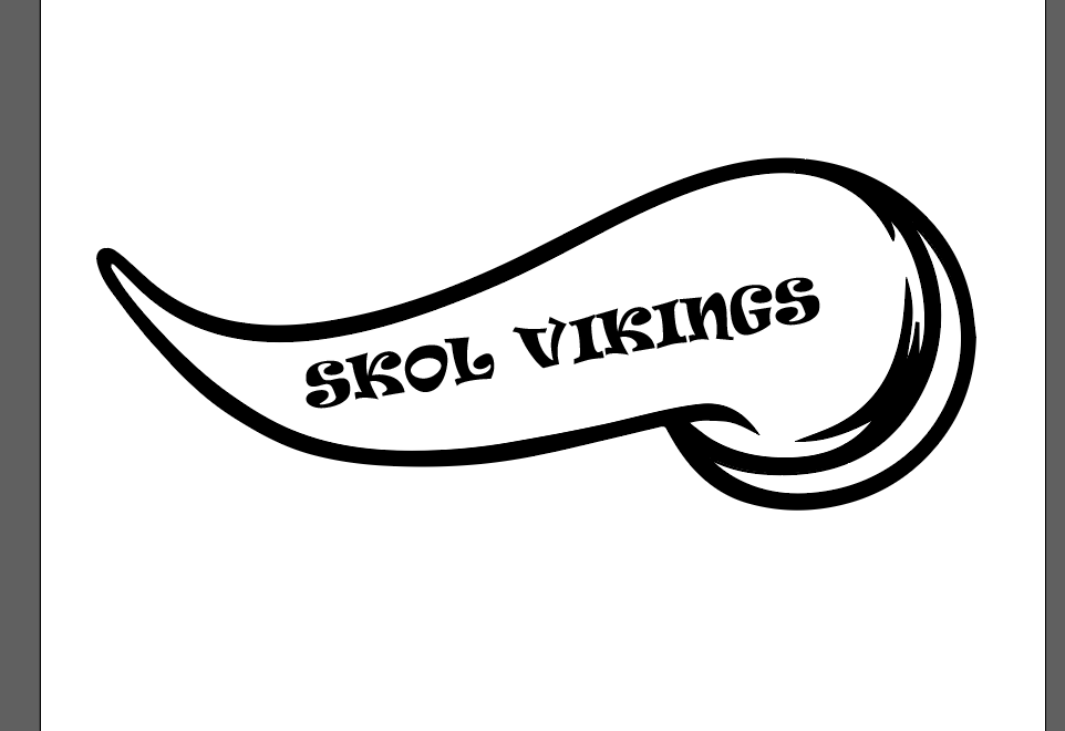
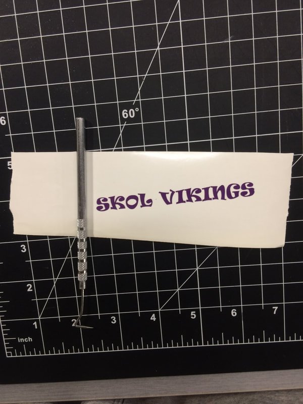
I then also wanted to put words on the logo that were the Viking fights song, "Skol Vikings". I would've loved to make the font the one that the team uses, but I needed an administrator password. When I was making this, there was a sub and he didn't know the password. So I used a different font that I liked the look of. This is what I came up with.
Steps
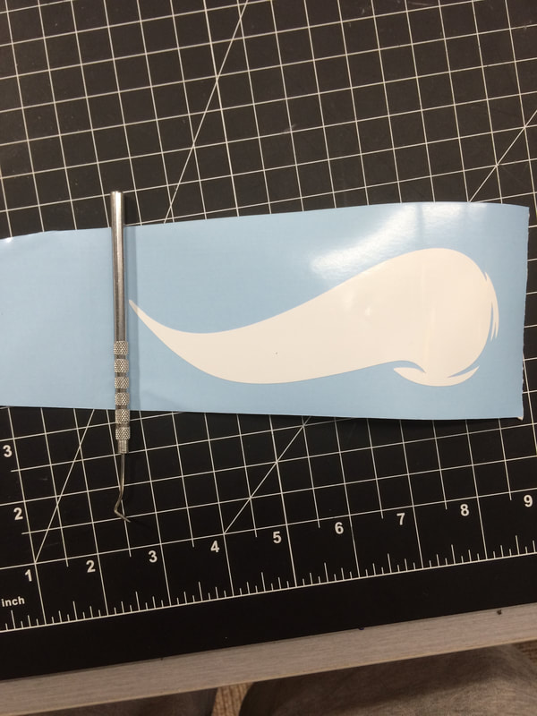
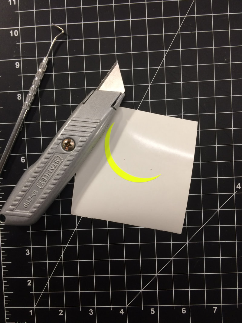
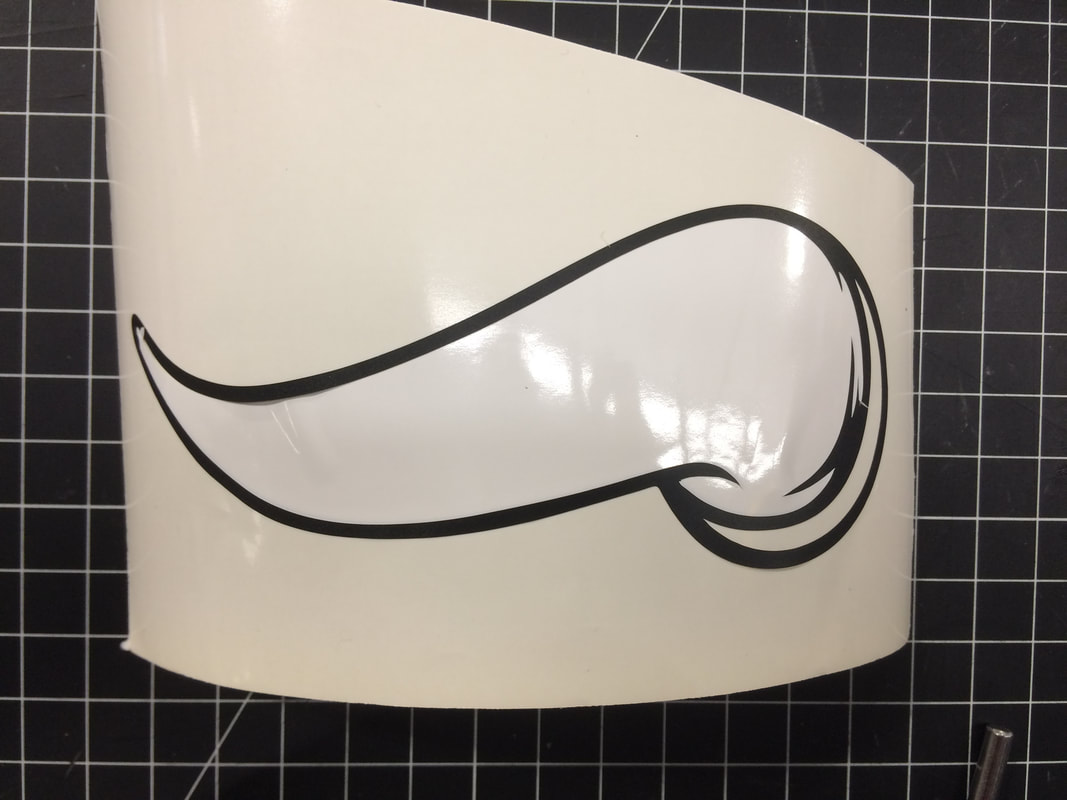
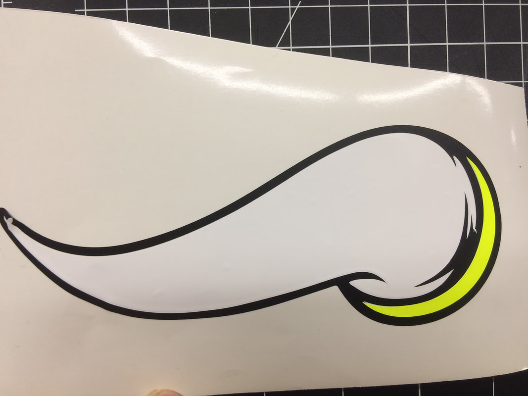
As you can see above, I designed the product in Illustrator. After that, I printed out each layer in it's respected color, and took of the excess vinyl I didn't need.
|
|
|
|
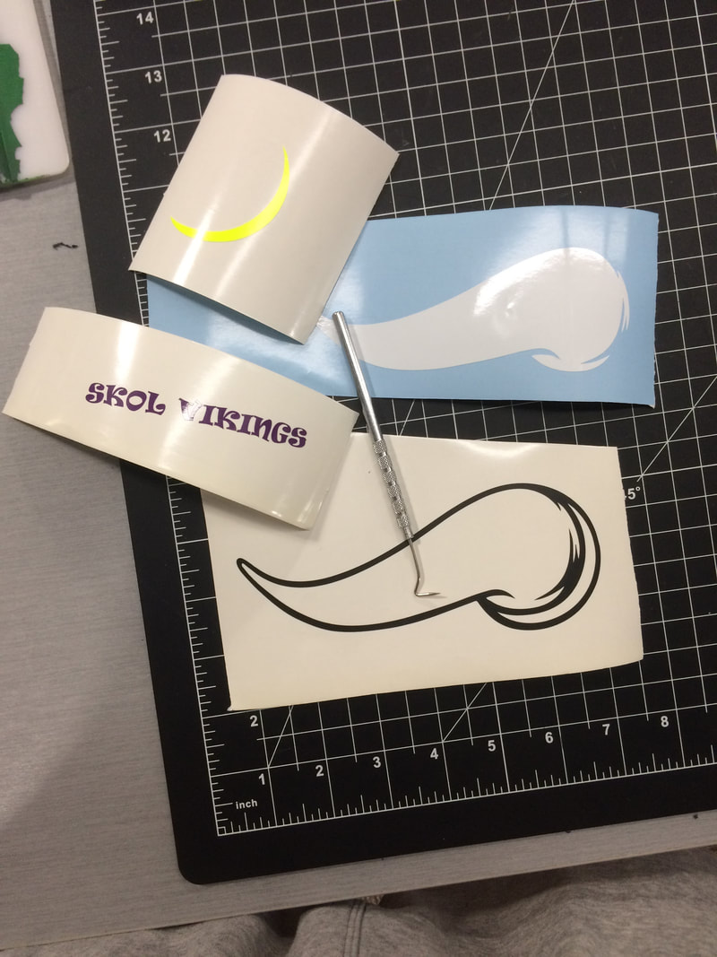
Next I used the tape to put each layer onto the same piece of paper, I chose to not move the black one. I put each of the other stickers onto the paper with the black sticker already on it. This is how it went.
|
|
|
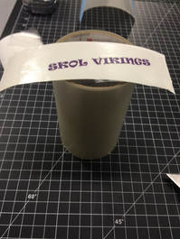
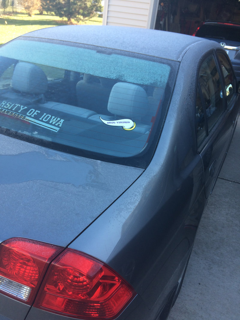
Then I stuck this on the back of my car. I had to heat up the car first and clean off the area that I was placing the sticker on. This is the final product.
What I Learned
During this rotation, I learned that I am not the very best at Illustrator. It is best for me to keep everything simple in the design process. I think that if I was to do this again, I would see if there was another yellow that doesn't look neon, and I would also make the sticker bigger. I think that the iowa sticker and the Vikings sticker don't go well together but the Iowa sticker will be taken off soon.
